Introducing Snorkel, the Dive Design System

UX - Auditing and analysis
UI - Standardizing designs
Documentation
StakeholdersDesign team
In the fall of 2018, Industry Dive began to transition from a scrappy startup model with hybrid front-end designers and backend developers to one with two scrum teams comprised of product designers and full-stack engineers.
With this transition came a number of issues.
Engineers
- Were creating multiple versions of the same common components
- Continued to turn to our product designers for front-end guidance and ticket implementation
- Routinely had to navigate a complex set of SCSS partials and front-end code style guides
Product designers
- Spent a significant amount of time pair-coding or completing front-end development tasks
- Were not thinking globally and component-first when creating user interface (UI) mockups
To address these issues, the design team decided to build and maintain a design system for our publication websites.
When getting buy-in from Engineering, the team that would be using our design system, we laid out the following project goals and roadmap:
Design system goals:
- Enable developers to easily reference front-end code for common UI components
- Reduce bottlenecks and increase efficiency
- Provide a single source of truth
Design system roadmap:
- Create a new SCSS style guide that engineers can easily reference, prior to the completion of the Design System
- Create and roll out an MVP of the system with well-documented UI components and layouts
- Create a more comprehensive Version 1.0 of our design system based on feedback from Engineering
After Engineering was onboard, we began to plan and build our MVP.
Getting started
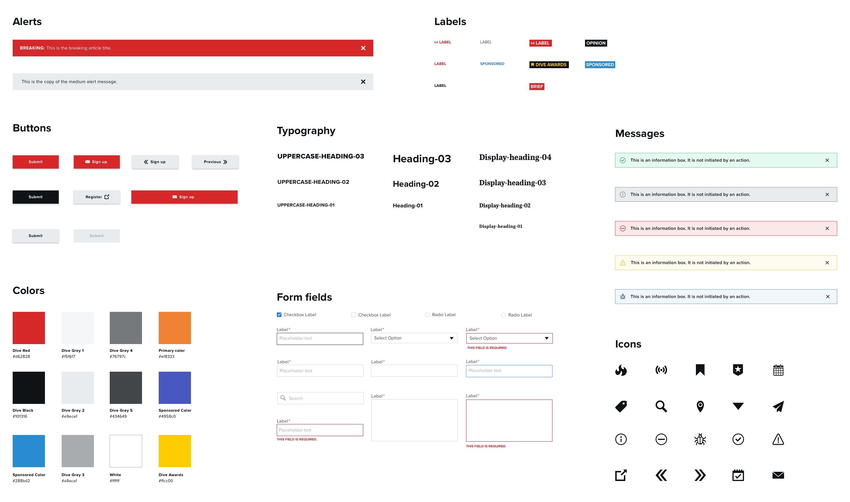
To kickstart the project, we made a list of UI components—e.g. alerts, buttons, etc.—that we commonly use throughout our publication websites. Although we planned to include design principles and guidelines, we focused on defining and creating reusable UI components first to maximize the practical value for Engineering.
After creating our MVP component list, we defined each component’s purpose—e.g. “Alert banners communicate key information, globally”—and determined if it was a stand-alone element (atom) or a group of smaller components (molecule). We also included two main design building blocks (utilities): color and typography.
Our initial list of components:
- Alerts (atom)
- Buttons (atom)
- Feeds (molecule)
- Form elements (atom)
- Labels (atom)
- Messages (atom)
- Sidebar boxes (molecule)
- Typography (utilities)
- Color (utilities)
Auditing our components
Before creating a system with our list of MVP components, we needed to audit their current design and functionality on our live publication sites.
Our approach was comprehensive; we printed out every unique website page template that used an MVP component and taped the pages to a wall. We then sorted the pages into categories based on intended function—e.g. soft, medium, and loud calls-to-action. We quickly saw design discrepancies across our categories. Using these buckets, we defined design guidelines and rules for component variations.
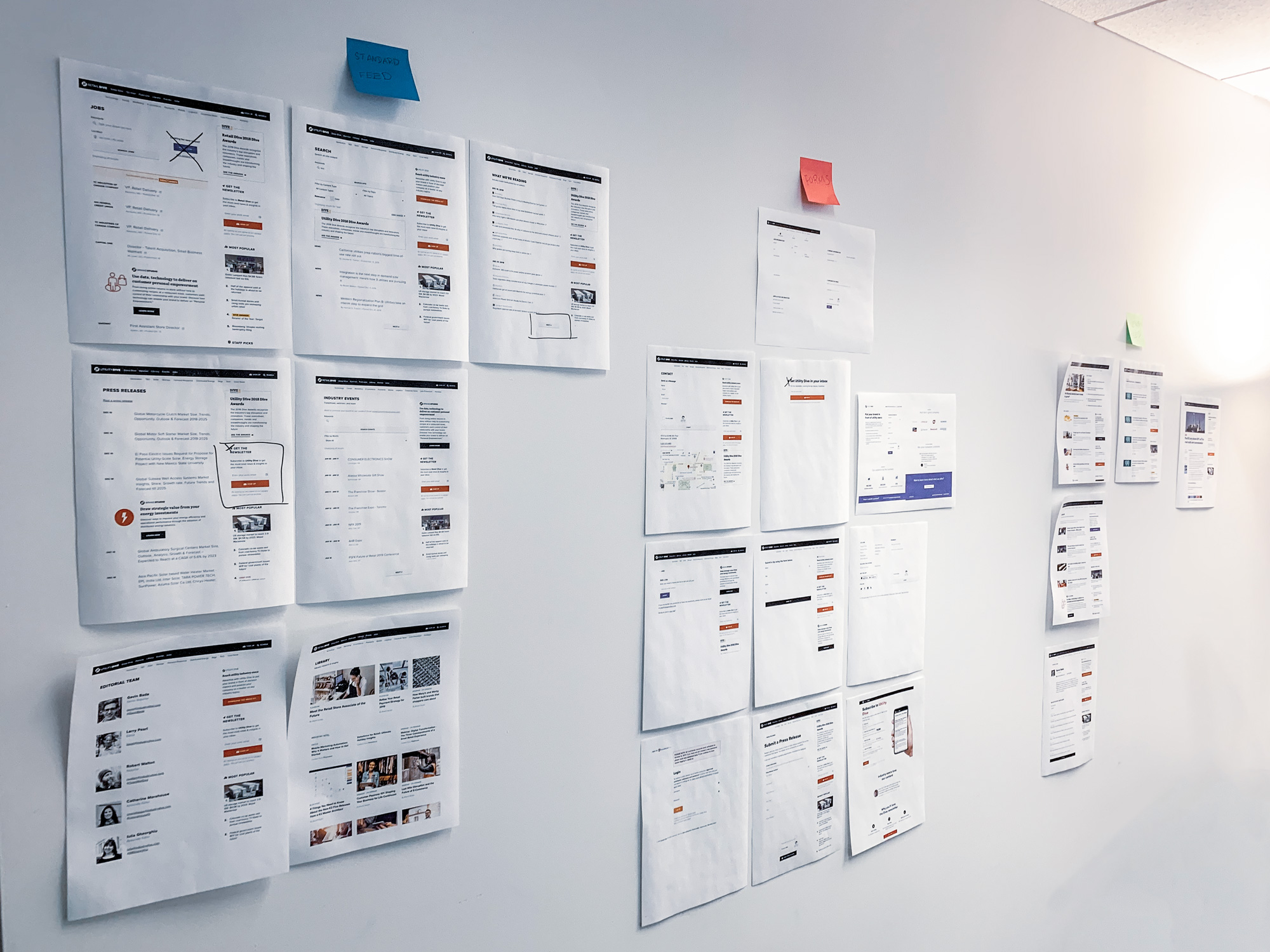
Example of our process for standardizing the “button” component:
- Hang a printout of each website page template—e.g. topic page, contact page, etc.—that contains a button on the wall
- Group the buttons based on the priority level of the action we want the user to take
- Loud buttons: Primary action of the page or component and directly linked to core product KPI—e.g. Increase signups
- Medium buttons: primary action of the page but not directly linked to core product KPI
- Soft buttons: secondary action on a page
- Define language and usage guidelines for all buttons
- Use sentence case
- Use as few words as possible in the CTA
- Use for submitting content, not navigation
- Define design guidelines for each variation
- Loud buttons: use primary site color (can include an icon)
- Medium buttons: use black and only on pages with forms as the main CTA
- Soft buttons: use grey and never full-width
Implementing the system
After the component audit, it was time to design and code the actual system.
The build took place in three phases:
- Technical implementation: Refactor the relevant code on our live publication sites
- Sketch library: Create a Sketch UI component library for designers
- Design system site: Implement an internal design system site for Engineering to reference
1. Technical implementation
Following our live site audit, we began to refactor the relevant production code. This mostly involved updating SCSS class names and removing page-specific styling.
As part of the refactoring, we modified our SASS partials to be consistent with our new components. After lots of debate, we decided on a BEM approach. This entailed naming classes based on the component (block) and appending “–” for modifiers and “__” for elements. After defining the style naming conventions, we applied them to the relevant components. We also deleted any page-specific styling that was being applied to the components. In the end, we eliminated a lot of code from our codebase, made styes more global in scope, and created a cohesive set of design patterns.
2. Sketch library
After implementing the design system in the production codebase, we created resources for our product designers. We use Sketch for mockup creation, so we created Sketch libraries to share components across the design team. Sketch libraries allow designers to grab a component—e.g. button—with a predefined style and use it across multiple files. This ensures UI consistency and negates the need to recreate the same components with each mockup.
We set up the Sketch file system to mirror our production code structure. Each component has its own Sketch library file with core symbols for variations. We used Dropbox to host and version control the files.
3. Design system site
After our design audit and Sketch library were complete, we created a dedicated website to make it easy for Engineering to reference the code and related documentation of all of our UI components. This site serves as a single source of truth for engineers, designers and all other internal employees.
The main requirements for our MVP launch were:
- An overview of Snorkel’s purpose
- Easy navigation to each component
- Component detail pages with guidelines and code snippets
We developed the site using our blog as inspiration for the technical architecture (Jekyll + Github pages). We then asked representatives from the Engineering team to review the site to ensure it met their needs.
With final approval from Engineering leadership, we formally rolled out the design system for our scrum teams to begin using.
Moving forward from this MVP, we plan to gather user feedback from our developers, write more detailed usage guidelines and explore ways to speed up our development process.
Team:
VP of Design - Ryan McKnight
Product Designers - Natalie Forman, Jordan Branch