The challenge
Industry Dive updated its mission statement to accurately represent the company’s aspirations.
New mission statement:
Help decision-makers stay ahead in competitive industries by producing the business world’s most respected journalism. Our insights spark innovation, fuel growth and shape agendas in every industry we cover.
As part of this initiative, the corporate website received a refresh in two phases. First, a three week sprint to update the homepage for an all-hands company meeting announcing the new vision. Second, updating the Careers and About pages to incorporate the new homepage design aesthetic and better convey the company values and culture.
Design discovery
Design sprint
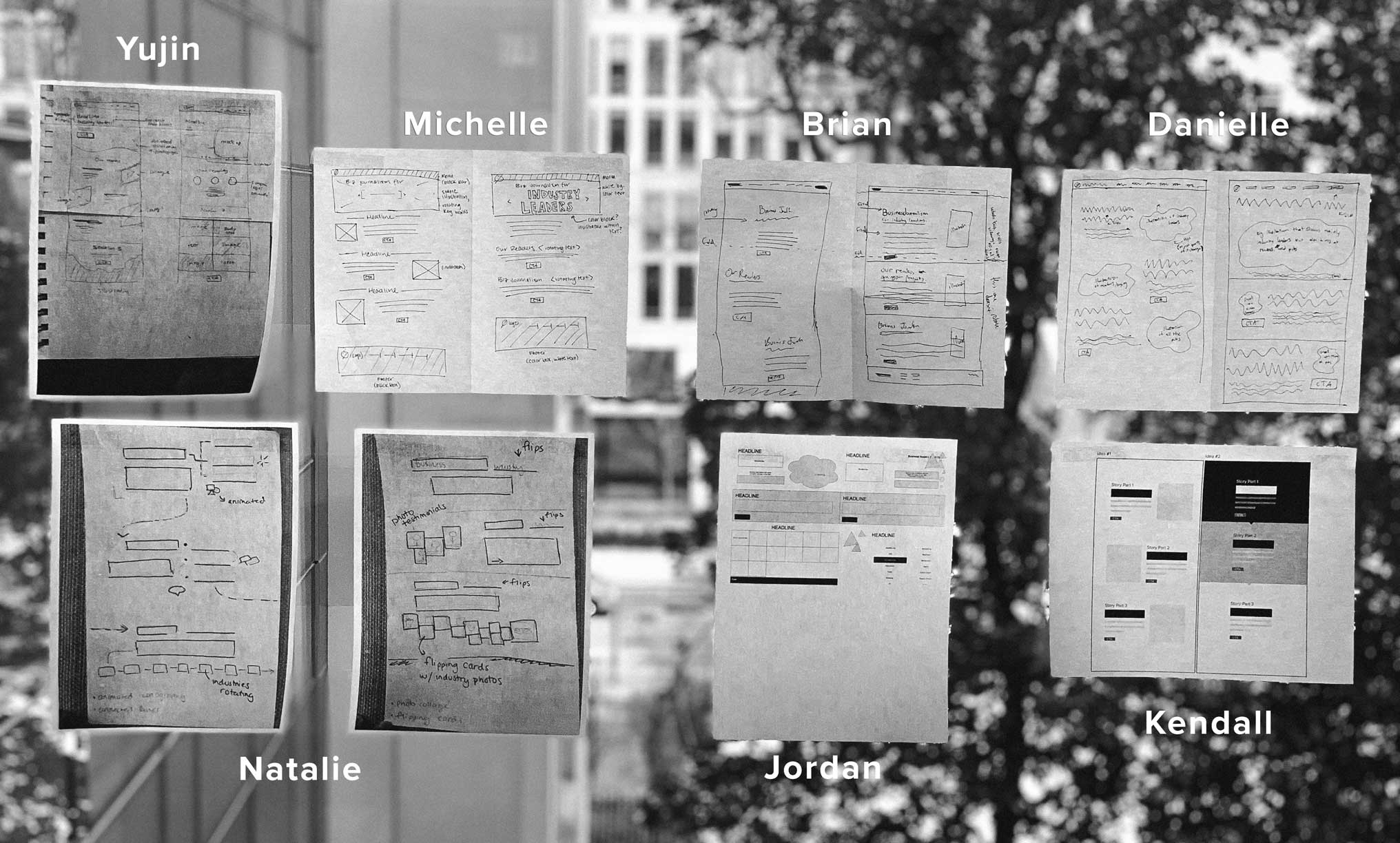
The design team had three weeks to draft mocks, secure stakeholder approval, implement the front-end code and deploy the updates to the homepage. To accommodate the tight turnaround, we kick-started the discovery phase with a sprint involving the entire design team. The goal of the sprint was to quickly provide myself and Jordan Branch, the team product designers, with a wide range of layout and animation concepts from which to draw inspiration. An added benefit of the exercise was an opportunity for the entire design department to collaborate.
We modeled the design sprint off of a GV sprint session and structured it as follows:
- Generate ideas – Each member of the team wrote out ideas for a new corporate site homepage design – e.g. illustration-based sections, animated counters, video backgrounds, etc.
- Sketch – Each designer folded a blank sheet of paper in half and, leveraging the ideas they listed, sketched two homepage design concepts. We then taped all of the sketches to a large window.
- Speed critique – Each member of the team presented their sketches, and the entire group critiqued them.
Defining a new style
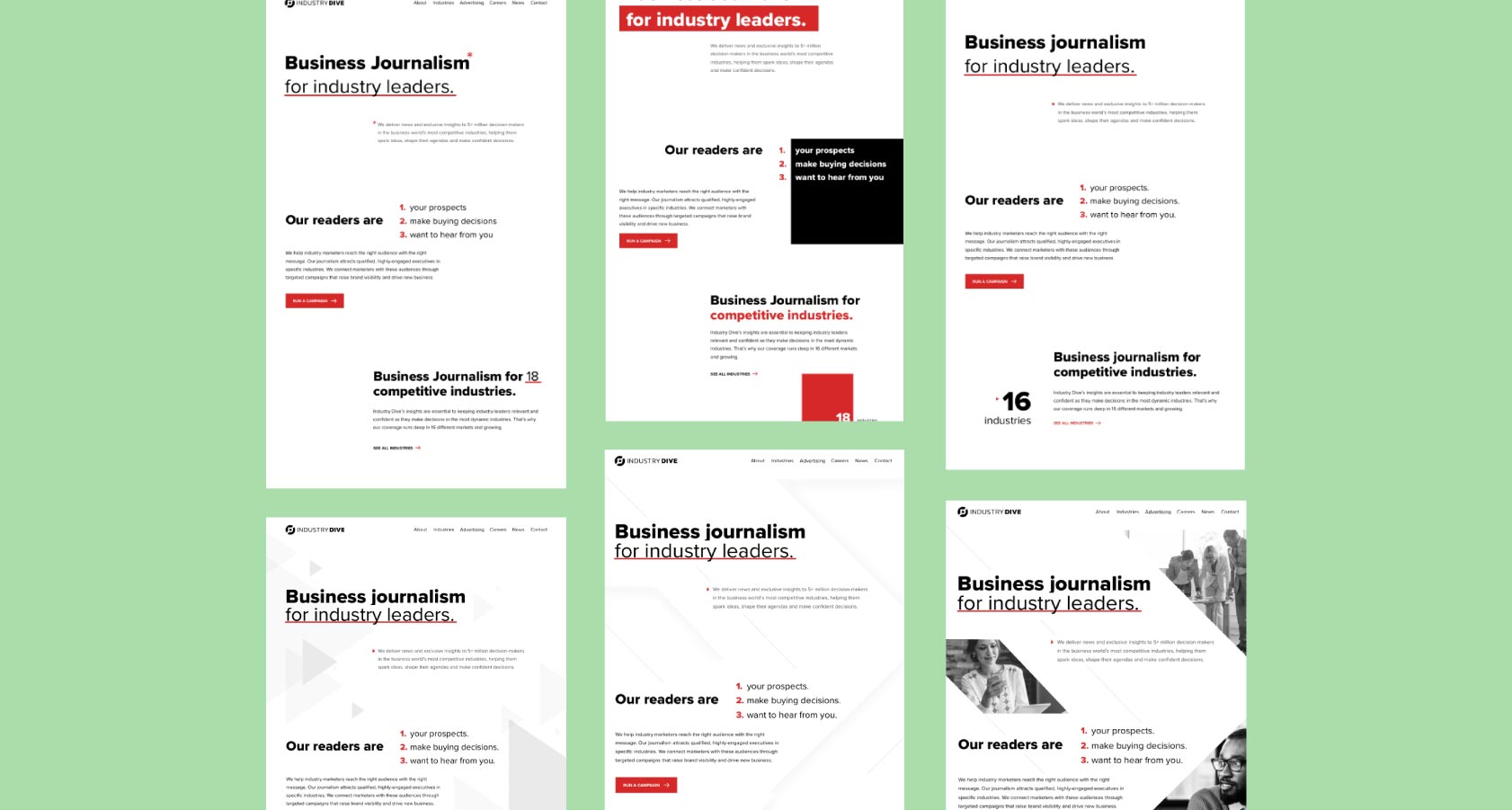
The sprint provided myself and Jordan with concepts to build upon to craft a new homepage. To visually reinforce the company’s identity as a modern business news publisher, we selected four overarching design patterns:
- Significant whitespace to guide the user
- Typography-centered design to highlight the journalism mission
- Accents of the company brand color to match our publication sites
- Imagery to provide secondary visual context
Kendall Davis, a senior graphic designer on the team, defined a chevron visual motif to compliment these patterns. The chevron represents progression and Industry Dive’s goal of moving industries forward.
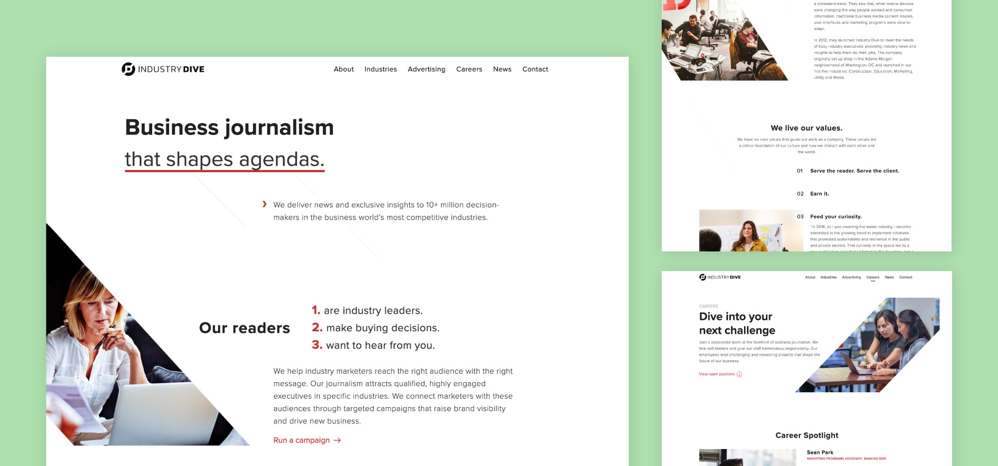
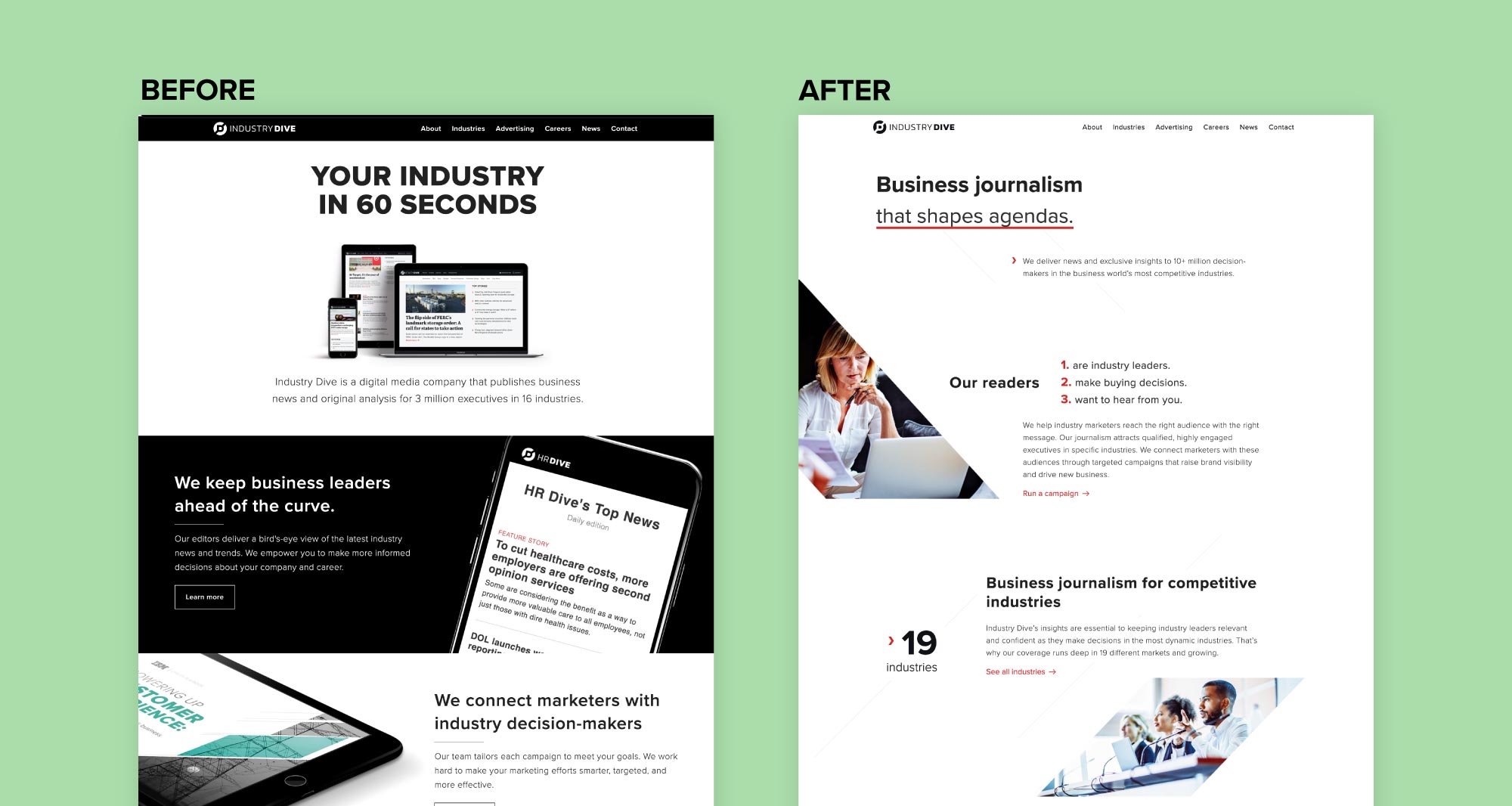
Designing the homepage
Based on the design patterns and chevron motif, we drafted mockups for the three defined page sections. The mockups played with typography, layout and animation transitions.
After evaluating the different mockups, Jordan and myself combined components from our designs into a final prototype. Keeping consistent with our defined patterns, we prioritized typography and white space over graphic elements. We used the chevron to flag important content and help direct user attention. We also incorporated simple lines angled like the sides of a chevron to visually unite the site and guide the user through the content.
After small critique sessions and design adjustments, we implemented the new page and unveiled it to the company alongside the new mission statement.
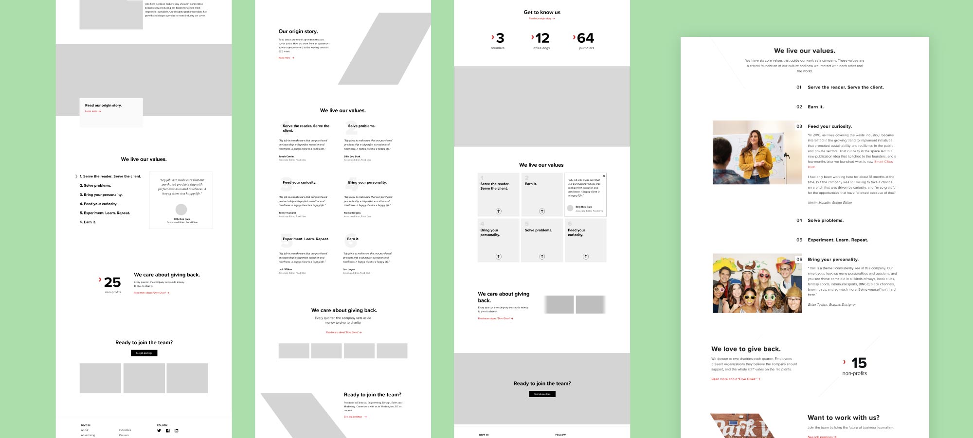
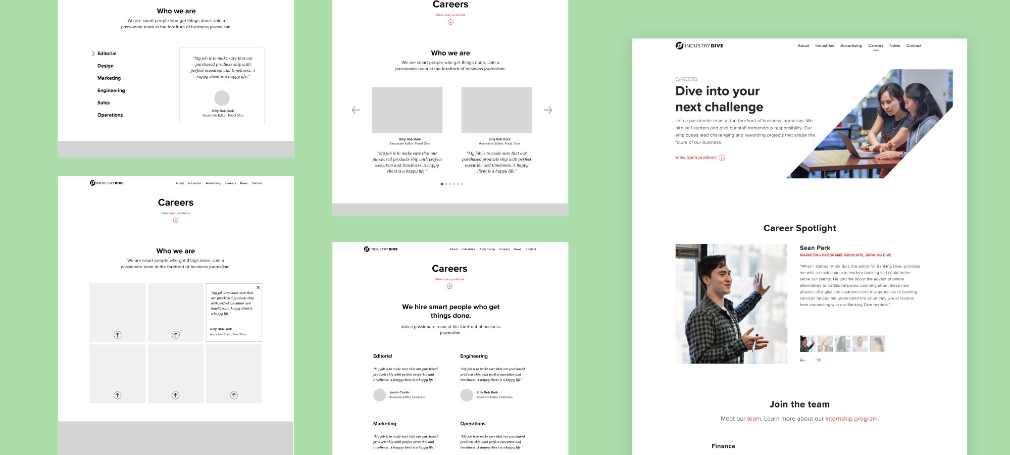
Designing the About and Careers pages
After redesigning the homepage, we tackled the About and Careers pages to ensure a consistent message for potential clients, investors and employees.
Similar to the homepage collaborative process, Jordan and I broke the pages into sections and mocked up different solutions. A few sections provided unique design challenges.
Page headers
Previously, the page headers were entirely text based with large CTAs. To create a more welcoming design that communicates the company values we wanted to incorporate imagery of employees. We wanted the headers to be consistent to create a cohesive design while not identical to increase visual interest across the pages.
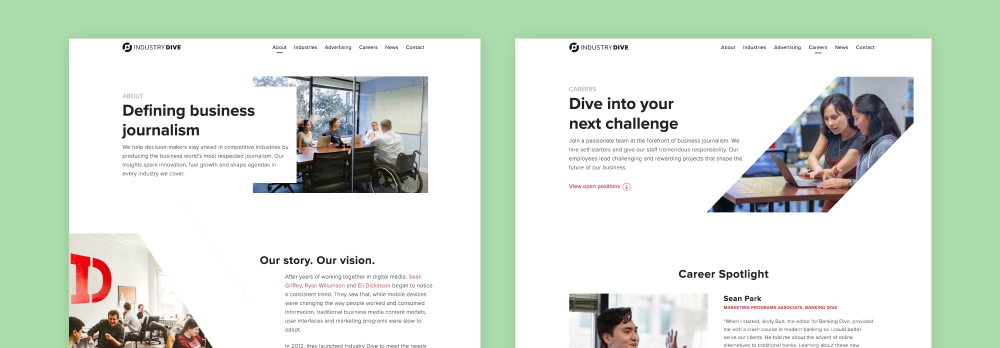
Company values
A new section was added to highlight the six company values. Designing this section was challenging as we had to decide if the values could stand alone or if they needed additional explanation or stories. While an employee testimonial would reinforce the values, we didn’t want the section to become too long and lose reader interest. We chose to outline all six values while only providing testimonials for two of them.
Career spotlight
The Careers page successfully communicated job opportunities and benefits the company offers. What it did not provide was a connection to current employees and the company’s investment in individuals. Similar to the company values section, we wanted to comprehensively address the problem without creating reader fatigue. We chose a carousel for this section to offer insight into employee’s experiences without pushing the job openings too low.
With the new design, the highest-traffic website pages are now consistent with the company’s mission statement. Hopefully this will increase job applicants and client interest in reaching Industry Dive’s high-quality audience.